Master Word Graphic Design Diary: Simple is Complicated!
Simple is Complicated!
(or, The Puzzle of Determining an Artistic Direction for a Game Without a Theme.)
The process behind creating the visual assets for Master Word was much more of a collaborative effort than a complete ‘work’ conceived and carried out by one person.. which is often the way of things at Scorpion Masqué.
For the visuals of this game, the final result is a real fusion between the work of the illustrator (my longtime friend and veteran video-game artist Nils, who has also illustrated 3 of our other games); the modern graphic design of our graphic designer/illustrator Sébastien; the visions of Christian (Scorpion Masqué’s Grand Poobah); and finally me, the Creative Director (a little-used title in the board game world, that situates me at the crossroads of the visual and mechanical experience of our games).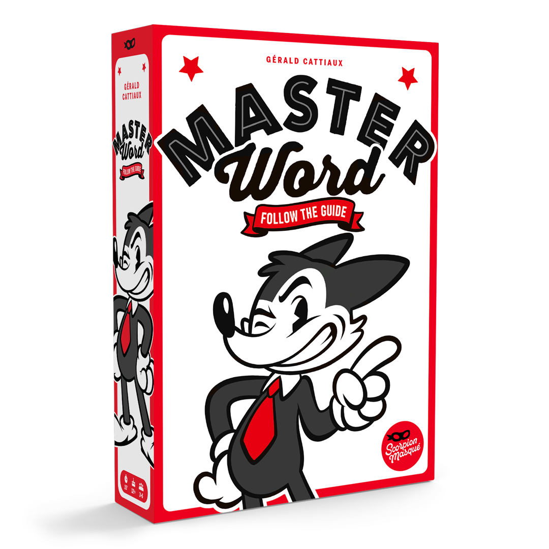
This box (and its design) that seems so simple was, in fact, a work that was constantly doubted, second-guessed, brought back to the table, and re-designed over the course of 3 months. This investment of time and resources was totally over-the-top for a ‘silly little’ party game, but, as they say, being simple is complicated! Especially when we ask ourselves too many questions, and we don’t want to be ‘like everyone else’!
How would you like your game: with or without a theme?
If you’re making a zombie game, you stick a zombie and a cheerleader holding an axe on the cover of your game, and voilà! If you make a classic fantasy game, you throw a dwarf, an elf, and a knight in there, and you’ve covered your bases. You then simply have to decide if you want your visuals to be serious or more cartoony, and bada-boom, you’ve got all the elements you need for your cover (yes, I know, it’s not that easy, but let’s allow ourselves this caricature for the sake of demonstrating the point).
The characters we see on these box covers are the player’s ‘avatars’, the imaginary characters they will take on during the game.
But a themeless game gives you nothing to represent! ...So what do you use?
When making a party game with words you are addressing a very wide audience which, without a fairly restrained visual style, could easily be frightened off. It’s also very easy to get lost as you try to reinvent everything along the way.
If you put ‘too much’ theme into your word-based party game by adding space ships, asteroids, and lasers, nobody is going to understand what category your game should be in… and you risk losing people who will react against your choice (“I hate Star Wars, so this game is clearly not for me!”).
If you are too much ‘like everyone else’ and do what they are doing (a big colourful title written on an equally-colourful background) then you risk falling into anonymity, drowning in hundreds of games that are forgotten before they even come out, victims of the ‘do what works’ mentality.

/pic3690440.jpg)


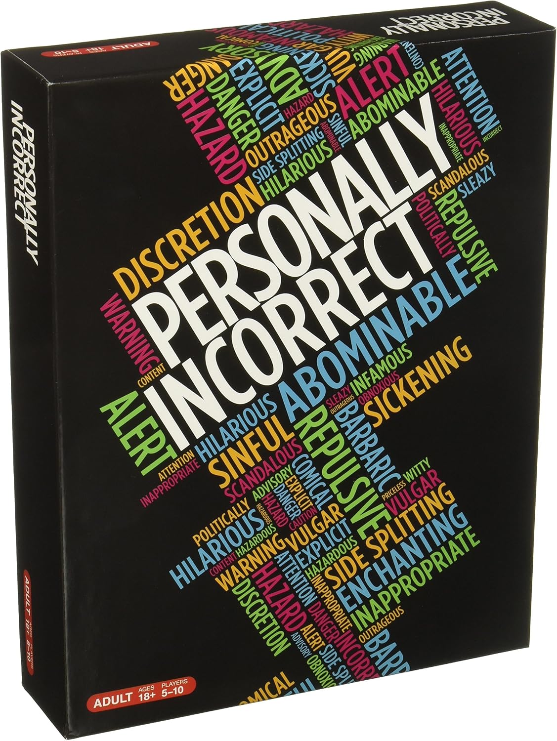
For a few years now, foul-mouthed party games have carved a niche for themselves within the industry by establishing their own particular graphic design code.
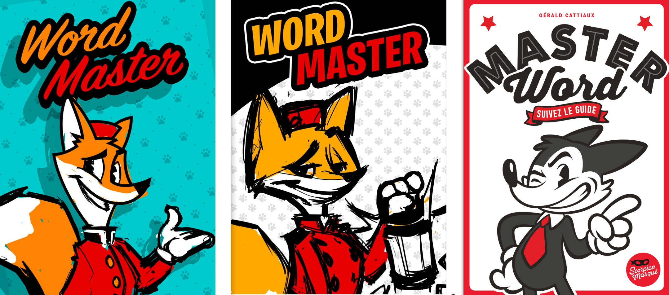
Yes, this is essentially the same game 3 times…

Amateur party game enthusiasts don’t expect this:


For me, Trapwords is well-executed, but it’s hard to know exactly what to expect with this illustration. It’s probably too heavily ‘themed’, which alienates more people than it attracts.
This also presents a significant risk of falling into the black hole between party game and thematic game...
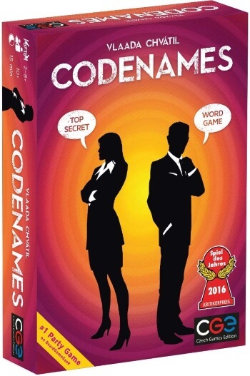
When Repos Prod revealed this minimalist cover, many people considered it commercial suicide.
And yet, somehow it still managed to be hugely successful...

In fact, some covers in this vein have really stood out recently…


Let’s do a little thought experiment:
What is the best box art for a themeless party game you’ve seen in the last little while? As in, that stood out and that you thought was nice? Difficult, isn't it? More often than not, they ‘do the job’, but don’t really touch us in any significant way. We understand what to expect from the game, and the art doesn’t drive us away… but it doesn’t spontaneously attract us either!
All this to say that this type of game has always given us a tough time at Scorpion Masqué. Considering the sheer volume of games being released into the marketplace, doesn’t ‘doing it like everyone else’ become riskier than trying something new?
In wanting to stand out we took a few paths, with varying levels of success, in our pursuit of the winning formula…


...until we finally managed to focus on who our games are made for:

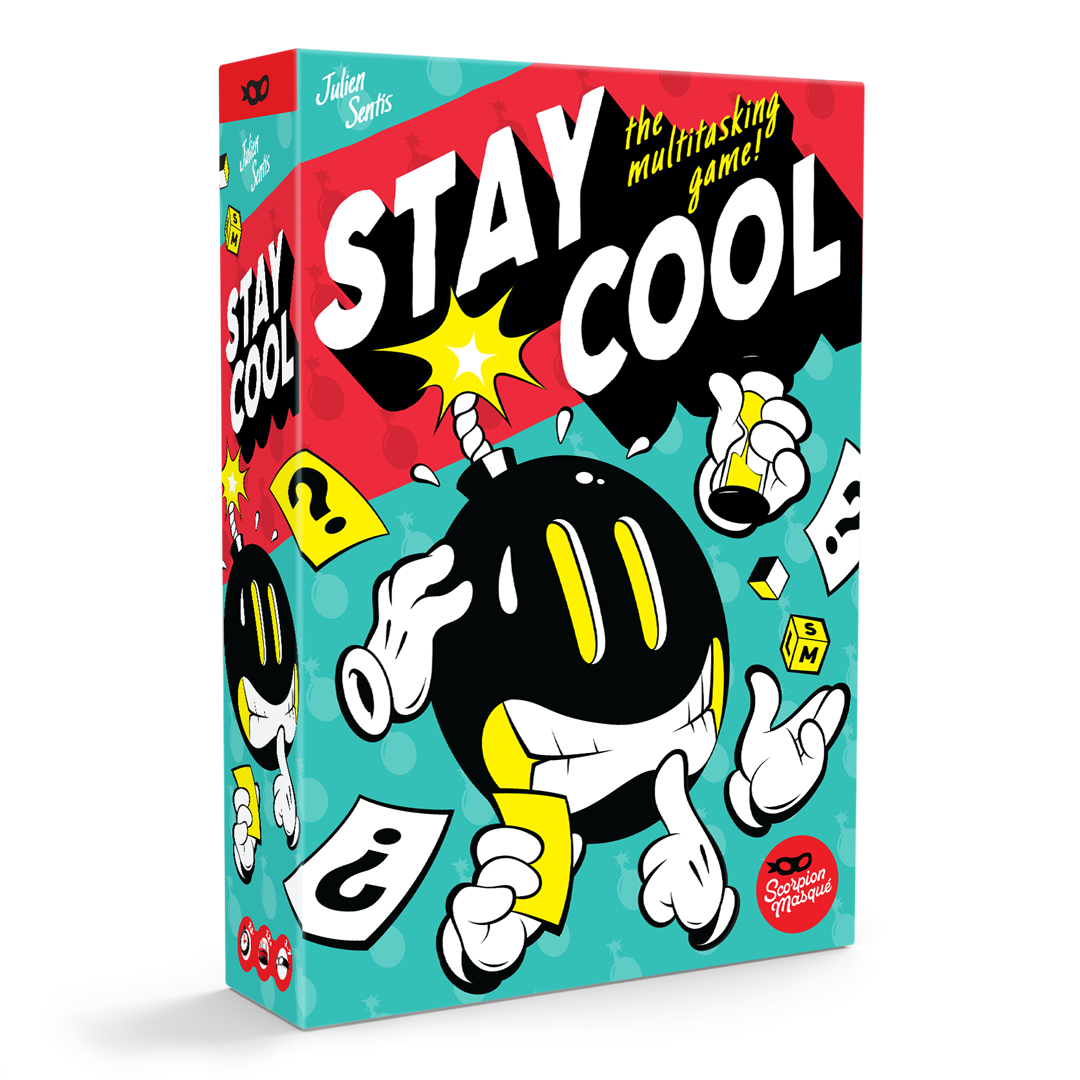
Building on the success (which had evaded us to this point) of the covers of Decrypto and Stay Cool (another collaboration with Nils), and because every success deserves a trilogy, we wanted to drive home our advantage even further with our ‘old cartoon’ characters with their white gloves!
In a themeless game, the character… is ‘you’
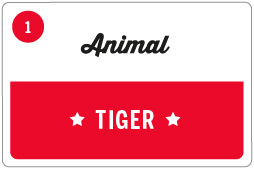
Christian and I love ‘characters’. We like that a little character can bring a big personality to a game. And it’s also easier to identify and memorize: “you know, the game with the green dog…?” is a lot better than, “you know… the game where you have to guess a word from some other words…?” In Master Word, one player is a guide; why not play around with that?
But creating a character is a hazardous undertaking: A girl? A boy? Young? Old? Black? White? Asian? Inner-city style? Hipster? Countryside? Will this character be ‘You’ enough to identify with?
Remember, when you play a game with a theme, the character on the cover (barbarian, astronaut, medieval peasant…) is an avatar that you will embody during the game. It doesn’t need to be exactly you, but it has to satisfy your fantasy, be it of power, of nobility... or even of cruelty!
But if the game doesn’t have a theme, the human character on the cover is pretty much ‘you’, and the style or type of representation could get in the way of you identifying with it. When humans are pictured on the covers of party games they are, for the most part, represented as silhouettes, upon which players can project images of themselves. That’s certainly one way around it, but it hardly creates a strong connection.
How do you create a character that is neither an avatar, nor ‘you’? A kind of mascot…?

Is it an object, like the bomb in Stay Cool, or the little computer in Decrypto? Or a human-like animal, that classic cartoon and comic trope dating back more than 100 years?
The fox is an easy choice for a cheeky character in a game where we’re asked to be clever… but this leads us to Concern #2 for graphic design in a party game for (mostly) adults: will this be too childish?
Christian and I wagered that if our character’s look was a mix of extreme retro and modern ‘street’, rendered in an unmistakably adult, contemporary graphic style, we’d put that concern to rest. A little research into some of the best-known adult animation universes would be the best place to start.
The classics:

Modern works in the classic style:

Street style with Montreal-based 123Klan:

From that we got the first sketches from Nils, which were a little too cute, a little too childish:

A guide that is a little too charming and cute:

Back to the drawing board: cheekier and more ‘street’!


There’s the mischievous look we were after!

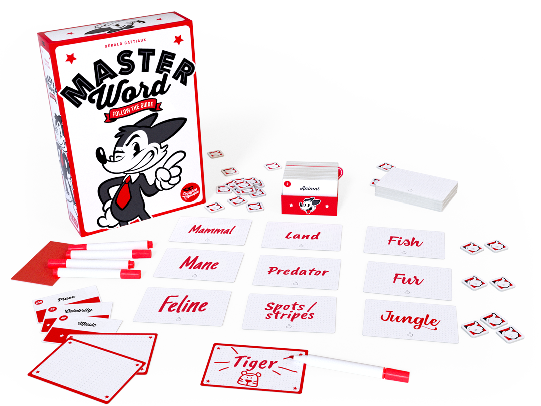
Logo and Packaging
So the character lines up perfectly with the rest of the retro line established by Decrypto and Stay Cool… but this time we envisioned a super-clean graphic design and a white background, to create a strong contrast to all the other games of the same genre. The contrast is also important for creating a visual that is modern, fun, and engaging, despite the retro choice of black and white for the mascot, and of white for the background. As we saw above, white boxes had already made their mark on store shelves, and we were going to build on that. But, as we also saw above, fans of party games like their boxes colourful and full of cartoon-y lettering.
As the character is a mix of old and new, the title's style should also follow this trend. Luckily for us, a there’s a bit of a hipster movement going on that is following exactly the same lines of inspiration as us!


It was no small feat to find a visual that was both clean and efficient to put on the box (our ‘Cover’ folder has 80 different iterations, not counting the versions that Nils proposed!!)
Here are some of the early research pieces by Nils in the ‘That’s All Folks!’ style”:

In the midst of all these reiterations, we were starting to have a hard time seeing the wood for the trees. We needed a new pair of eyes to guide us, and Gérald Cattiaux, the game’s designer stepped up (who, for his part, was a little concerned with the iconoclastic path we had taken). With one glance, he was able to help us understand that our intermediate version was much too bland. Discussions with José from Asmodee France, and Tom Vuarchex, our favourite illustrator/graphic designer (illugraphiste, as he calls himself!), gently pushed us toward the contour and the red stars that both add colour and create a link to the party game concept.
Too bland!

Perfecto!
It’s also worth noting that for the red, we wanted to use a fluorescent pantone colour close to the neon colour of the Switch Joy-Con controllers, but the factory was never able to find the ink that would produce that result. This being the case, we decided to opt for a more classic red.
The rest of the game’s materials matches the style established by the box. Two colours, red and black, simple and efficient. The little fox heads on the card-holder distinguish the back from the front. The Clue Cards could have been completely white, but a light dotted grid motif and the little thumb indicating where the Joker should be placed gives an elegant look that links them with the rest of the game’s materials.
Simple is Complicated
And there you have it, a summary of our team’s peregrinations, our doubts, our second-guessing, the process we went through to achieve visuals that are not simply old-fahshioned retro skins, but instead graphics that use those retro concepts as jumping-off points to reconstruct something fresh and modern. We hope we have created something that stands out from ‘what everyone does’, while still staying within the tastes of those who love party games.
To survive this kind of exhaustive process, each contributor has to focus on their craft, reiterating and reiterating until the goal is achieved. We can expect some resistance from some of the more conservative elements of society, but we feel we had a clear direction from the start, a good understanding of people's tastes and their reactions, good intuition, and a strong sense of confidence in the fact that the goal we set ourselves would work and was attainable.
The worst part, in fact, is that the development of the game design itself was a similar story… but that’s one for another time.
For more cool content like this, click the Subscribe button below!

Posted by Manuel Sanchez
About Scorpion Masqué
Scorpion Masqué is celebrating its 20th anniversary this year! Scorpion Masqué is a leading Montreal-based tabletop game publisher part of the Hachette Group. Since 2006, our passion has been making quality games for children, adults, and the whole family, with the goal of creating memorable moments for everyone. With more than 50 published games, Scorpion Masqué is a recognizable and renowned brand on the international scene. We have a presence in more than 50 countries and have sold over 4.5 million games since the studio founding. Some of our successes include multi award-winning titles such as Zombie Kidz Evolution, Decrypto, Turing Machine, Sky Team, and Mooki Island.
Popular articles
-
June 18, 2026
-
June 16, 2026
-
April 17, 2026


-
June 18, 2026
-
June 16, 2026
-
April 17, 2026
Take a peek behind the curtain...
Once a month Scorpion Masqué's Grand Poobah shares his thoughts with you. From how the market has evolved, to writing rules that make sense, with detours into game mechanisms, you will get a glimpse at the board game industry from the point of view of a publisher.
Copyright © 2026 - Le Scorpion Masqué